Being a perfectionist with a short attention span sure gets me into sticky situations. Or maybe I should say that I like so many versions of different art projects that I have a hard time seeing them as someone else might. Are you ever too close to things to evaluate them well?
I’ve recently done a portrait of Lee Green, who I have known for years… as in I can hear his voice in my imagination and feel his calm. But which version of the project do I choose?
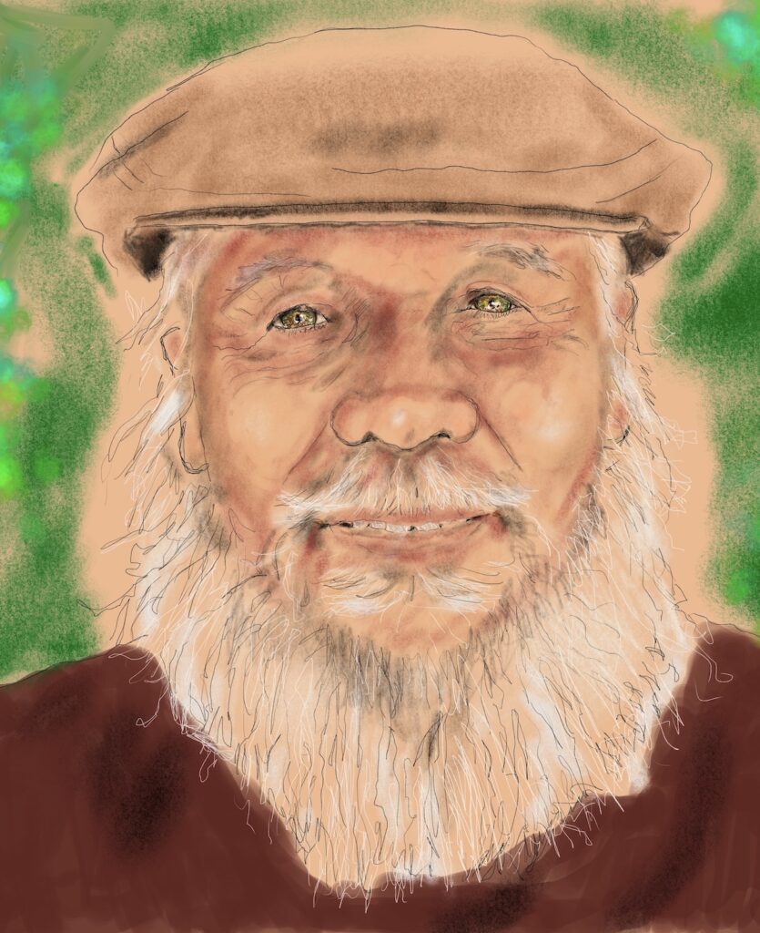
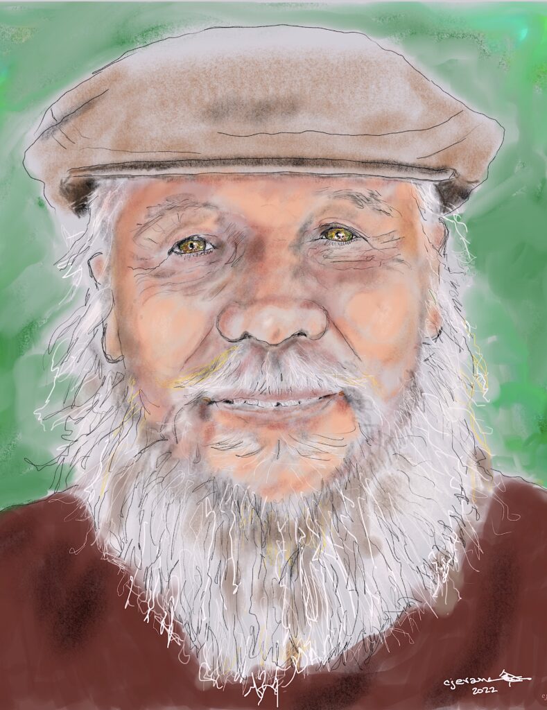
Does one speak to you more than the other? Do you know Lee? I get a warm sensation from the top one but a less dramatic sensation from the second. How about you?
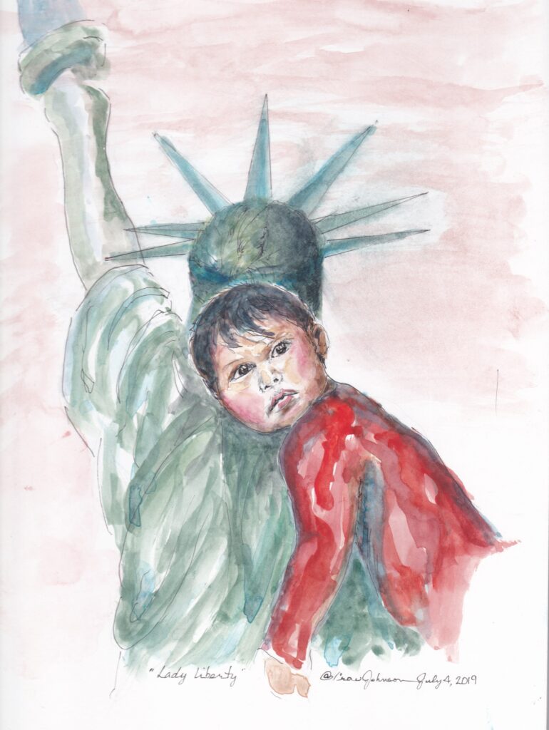
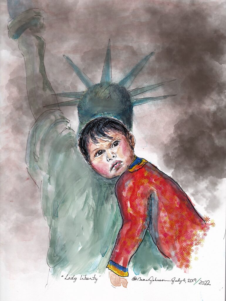
I learned that I see colors differently from others when my Mother told me that she just thought I picked gaudy on purpose1! Aggggg. Another consideration is which image gets the point across better. These two are versions of the same project. What do you think?
Raybo’s image was so neat to work with since so many friends embraced who he was.
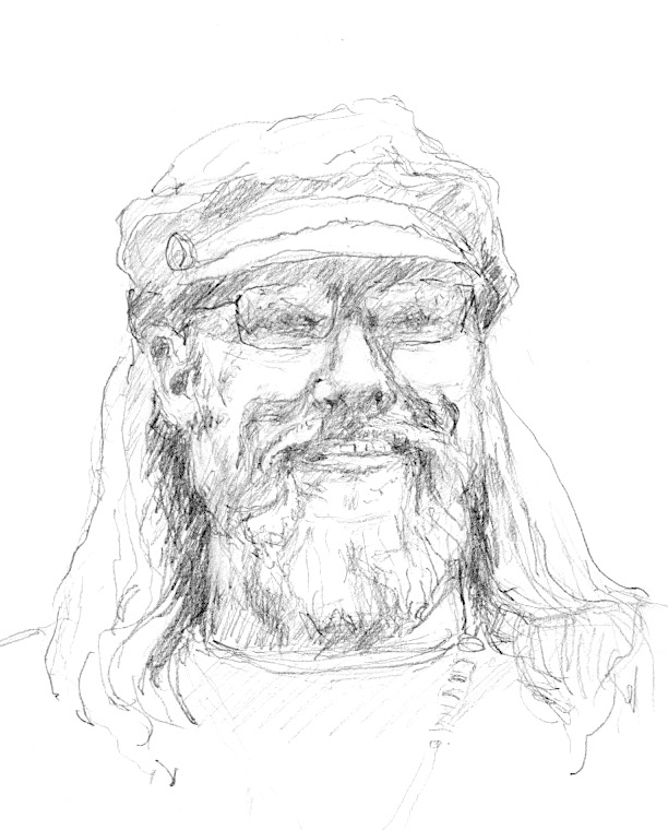
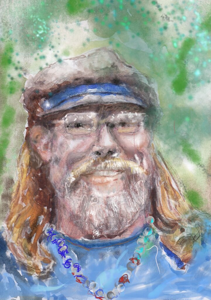
I love learning how people see things and why they are touched by some images but left cold by others. Thanks for listening… to my one-too-many choices ideas. Did you like the first or the second image?
Hi Crow –
You are so talented. I’m drawn to image #2 in all three sets. In the portrait of Lee I see much more definition and character in the lighter version. But then I’m a sucker for grey beards! Thank you for sharing your gifts.
Thanks Teri, I love your feedback. Sometimes I’m too close to the process to have perspective. I’ll keep at it.
Wow…what an interesting thing to ponder. I liked #2 in the the first two drawings. Especially the liberty with child. In the 2nd one the child really popped and touched my heart more…with liberty a bit more in the background…ghostly.
I like the pencil sketch of Raybo better for some reason.
You are such an amazing writer/artist and one of my greatest MUSES!!! Thanks for sharing.
Oh Donna, Thanks for writing. I love learning what you see and what works!..
Crow – All of these reflect the beautiful soul of the artist – I am amazed at your talent! I love all of them, but also lean towards #2 in each set. I do have to say, the way you did the eyes on Lee appear as if he is looking through the image to the viewer. I love these!
Julie, Thanks for taking the time and thought to answer my questions. Lee exudes a peaceful feeling through his eyes.. I’m so glad I got close. I’ve been cheering your explorations into artwork too! Never too late to learn.
Hi Crow – I am more drawn to image #1 in the first drawing of Lee Green (whom I did know a long time ago but haven’t seen in years) – I love the way you captured the light in his eyes in both images. In the second 2 drawings I prefer image #2 – both of which have more color and light/dark distinctions. All of them are beautiful drawings/paintings. –Emily
Thank you, Em. I’ve been having fun learning to draw and realizing that there’s no one way to do anything. Your viewpoint is really helpful. Thanks
Hi Crow I like Lee #1, the face has more depth/feeling to me. He looks more “alive”.
I like #1 Raybo too i see an overall image, #2 i am mainly pulled to see the boy, and lose the overall power of the whole picture. And I like #2 on the third set. Both of these are great, so its a hard choice. But I like colors too ? and the second shows a man with a really fun side.
Great job my friend! ✴️✴️✴️✴️✴️ (I don’t have a gold star symbol on my phone. Lol)
Oh Janelle. It’s great to get your takes on these different images. Thanks so much for your ideas!! I’ve been trying to do the impossible and learning that two dimensions can imply 3 or 4 dimensions. LOL
I like #2 pictures best Radine
Radine, Thanks for your ideas on this. Crow
It’s number 2 in each case. Not sure why, but it is!
Hey Paul, Thanks for jumping in on this. It sure is fun to see how folks see.
Hi Crow!
Love your work! I prefer the 2nd in each of these—In the first portrait I just like the lighter hair/beard as the energy just seems brighter to me. Also, the eyes seem to pop a bit more. The 2nd liberty & child sketch has more drama to me, and the last sketch, well…I guess I am just more drawn to color! Everyone is different tho, and it’s kind of fun to talk about a bit! Thanks for sharing your art!
Lisa, Thank you for sharing your reactions. Isn’t it amazing to try to put 3 dimensions into 2 dimensions? I’m loving the challenge of learning.
I do not know much about art but I love the first of the first two, especially the older man—the color seems to show more of who he is. Same with the child. Third one though I like the second one—color adds so much detail! Lovely work all, Crow! I cannot draw a thing! Beverly
Beverly, great comments. Your way of seeing is fascinating to me. No matter how accurate the marks may be, the emotion we carry away from an image is what we keep. Thank you
Hi Crow, I am more drawn to #2 in all of them. I don’t know Lee Green but somehow the second version send more natural to me. In the first one the background, especially the „glow“ around his head and beard doesn’t seem right. However, Crow, you are so talented! I wish I had only a small part of your art talent:-D
Oh, Philipp.. thanks so much for offering your impressions. It really helps me to imagine the way other people see. And of course, thank you for the compliments. I’m loving learning new things at this point in my life. All the best to yall
I have small opinions about the first 2 sets, but as for the picture of Raybo, I much prefer the version with more color. Keep on at it Crow!
Ky… love getting your response. I’ll keep on drawing … learning is fun at any age.
Let’s see. I like the first one of Lee (hi Lee!) because I feel the colors are more blended; the second of Lady Liberty because I feel it balances the child image better; I like the pen and ink of the third because it’s more dynamic and captures him better although I love its warm and varied palette! JMO!
Jan, I love your feedback! This is such an adventure. Very best, Crow